MapRun - New Look

classic Classic list List threaded Threaded
8 messages Options
Reply | Threaded
Open this post in threaded view
|

MapRun - New Look

Peter Effeney
Administrator
Colleagues,

We are progressively releasing MapRun version 7.22.1.

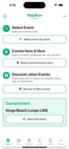
This modernises the User Interface of the MapRun App on Android and iOS.

Users have the option to switch back to the "Classic" user interface.

The new home page looks like this:


Any comments/feedback/suggestions are welcome.

Peter

Reply | Threaded
Open this post in threaded view
|

Re: MapRun - New Look

davidheffernan
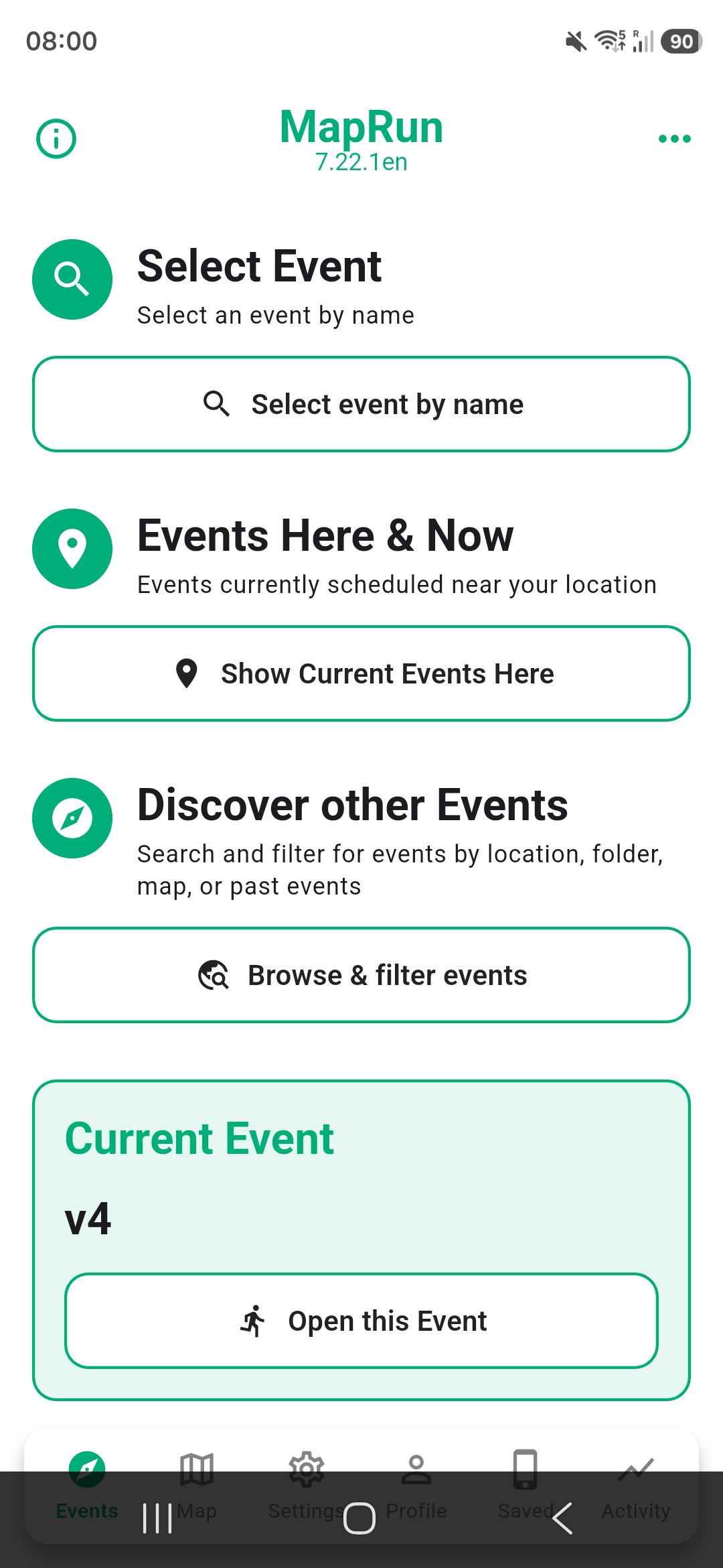
First of all I think the new look is a significant improvement. The grouping and highlighting makes it easier to visually break down the pages. A couple of comments. On my android device (S26 Ultra) the bottom row of icons is cropped for me by the phone UI: Secondly, and this isn't a comment on the new interface, but the options section I find very out-facing. Personally I think it would benefit from stronger segregation of the option groups. At the moment all options are visible and you scroll between them. Across many pages of scrolling. I wonder if it would help if the different groups could be viewed in isolation from each other group so you could look at all options in one group at once, more easily.
Reply | Threaded
Open this post in threaded view
|

Re: MapRun - New Look

Peter Effeney
Administrator
David,

Thanks I'll check that out.

Can you confirm, if the screen is scrollable or not? That is, can the menu be revealed by scrolling (not ideal, but helps with the diagnosis).

On "Options and Settings" - I agree that the current groups are probably too high a level/vague: Device, Event Display Options, Event, and Preferences. I have introduced the idea of "Favourites" to bring a user's commonly used settings to the top... but this area could do with some further work.

Peter
Reply | Threaded
Open this post in threaded view
|

Re: MapRun - New Look

davidheffernan
It's not scrollable. On this device users can choose between gesture navigation or three button navigation. And this bar is what you get with three button nav.

Most apps size themselves to be above the nav button bar. I'm not an android dev so I don't really know the terminology very well at all, hopefully it's clear.

As for the settings I have to say this is the one part of the app that still I find daunting and I'm an uber geek! I think some work there would really be valuable and make it an easier experience.
Reply | Threaded
Open this post in threaded view
|

Re: MapRun - New Look

Peter Effeney
Administrator
David,
I've released a patch to fix this.
In the MapRun App > Settings > Scroll to the bottom > Check for update > restart App.
Peter
Reply | Threaded
Open this post in threaded view
|

Re: MapRun - New Look

davidheffernan
Perfect, that's exactly how it should be. Good job!
Reply | Threaded
Open this post in threaded view
|

Re: MapRun - New Look

Charlie R
In reply to this post by Peter Effeney
I like this a lot. Our club is looking to replace old permanent orienteering courses with MapRun versions. For this to work with novices visiting a forest simple instruction on the visitor information board needs to get the app download and the user into the map with the minimum steps.

Events Here & Now looks just the job but a 50Km radius and a default sort by event date (I think) means that the POC location is way down the list below lots of other clubs criptically named training nights and one-off courses. I suspose "here" and "now" are at cross purposes. From our point of view a sort by least distance would be ideal.
The problems is that MapRun is so versitile and can be used for so many things (some of them quite complex) it is hard to maintain simplicity of interface as well.

But the new fromt end is a very good step forward.

Many thanks

Charie Reid
North West Orienteering Club
Reply | Threaded
Open this post in threaded view
|

Re: MapRun - New Look

Peter Effeney
Administrator
Charlie,

Thanks for taking the time to provide feedback.

You are correct to say that MapRun is used in many different ways.

The thinking behind the new look is that there are two common scenarios for selecting an event:

- A routine scheduled club event. The participant arrives at the event and wants a simple way to open the event that is on HERE and NOW. That is, near this location and not last-year's event, but the current one. This scenario accounts for a large % of the use of MapRun.

- The other scenario, is where the participant doesn't have a particular event in mind, but wants to discover/explore options - on a map, by a name search, or geographic folder. That is, is there a MapRun course near here or in some particular location they plan to visit.

For permanent courses - have you considered printing a MapRunLink on the visitor information board (a QR Code that takes the user directly to a particular event, or takes them to the link to install MapRun first)?

MapRunLinks are also useful for Club events, where a printed map is provided at registration. Having a MapRunLink on the printed map is a good way of ensuring that the user opens the MapRun event that relates to that printed map. That is, for example they don't accidentally have the print for the Long course and MapRun open on the Medium course.

We are keeping the MapRun User Interface under review and will look to make further refinements.

Thanks again.

Peter